All Lit Up: Nike's Neon-lit Womens Fall/Holiday Presentation
/Nike loyalists were able to experience shopping in a whole new light at Nike's luminescent NYC presentation dedicated to the Women's Fall/Holiday collection.
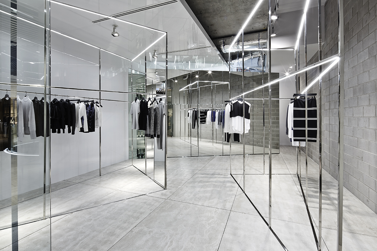
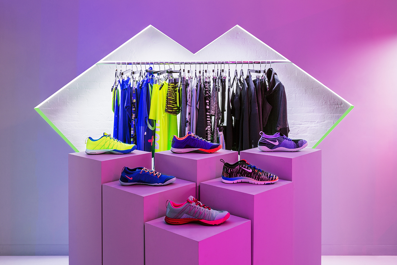
Neon-tinged windows cut out of walls, symmetrically-mirrored rooms and optical illusions create a compelling environment for Nike Women's Fall/Holiday collection. Set Designer Robert Storey and Creative Director Jen Brill team up to create a narrative space not merely dedicated to the shoes and clothes, but the lifestyle which defines Nike: "we live to move."
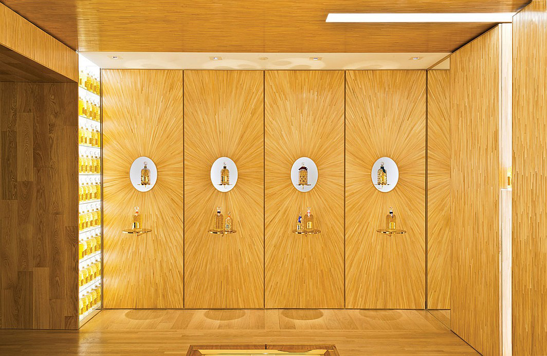
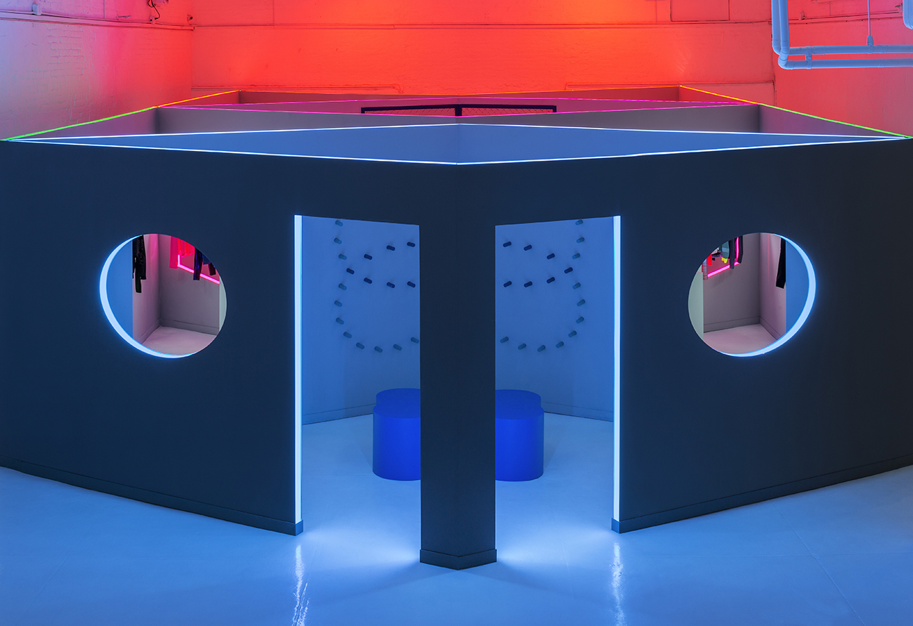
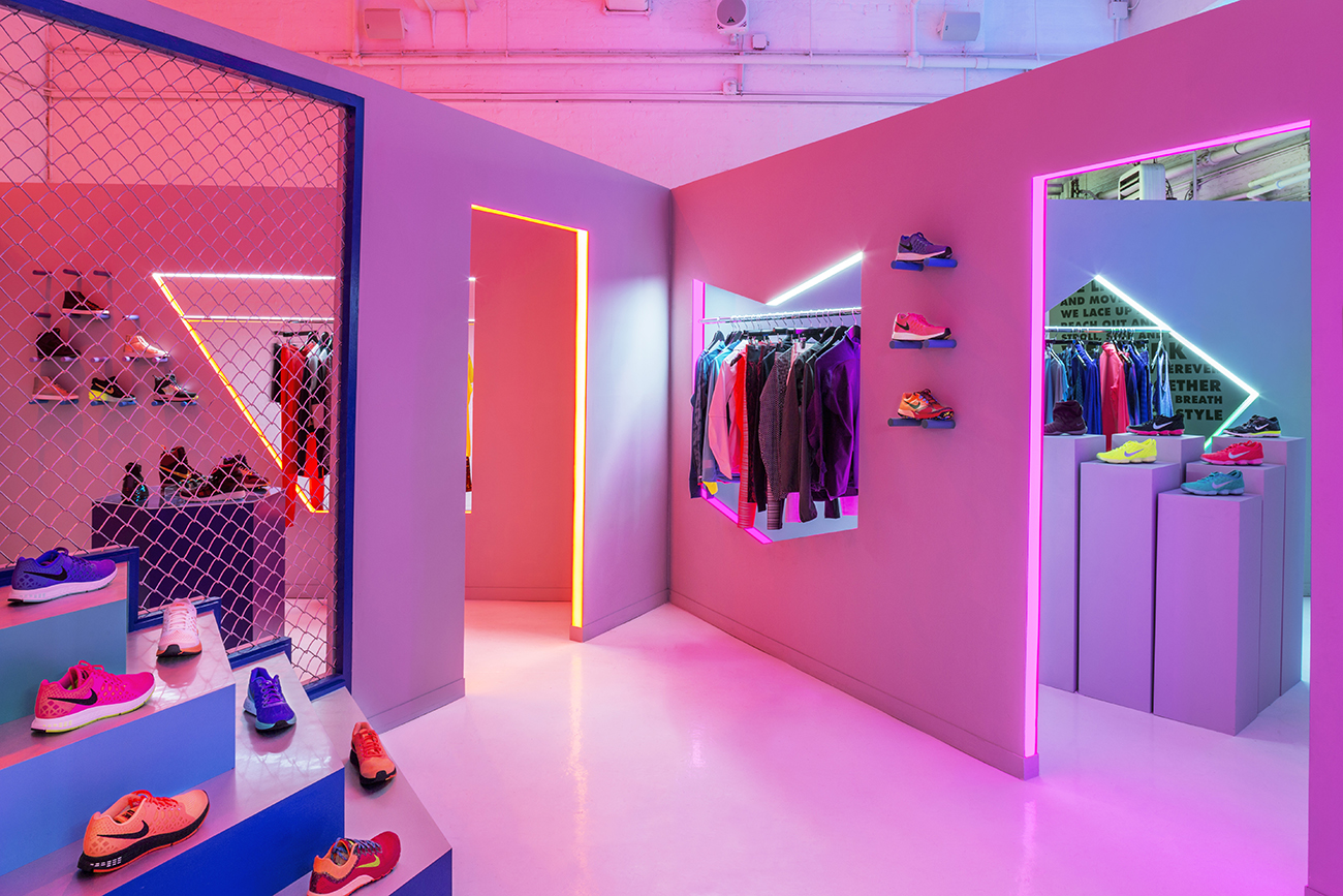
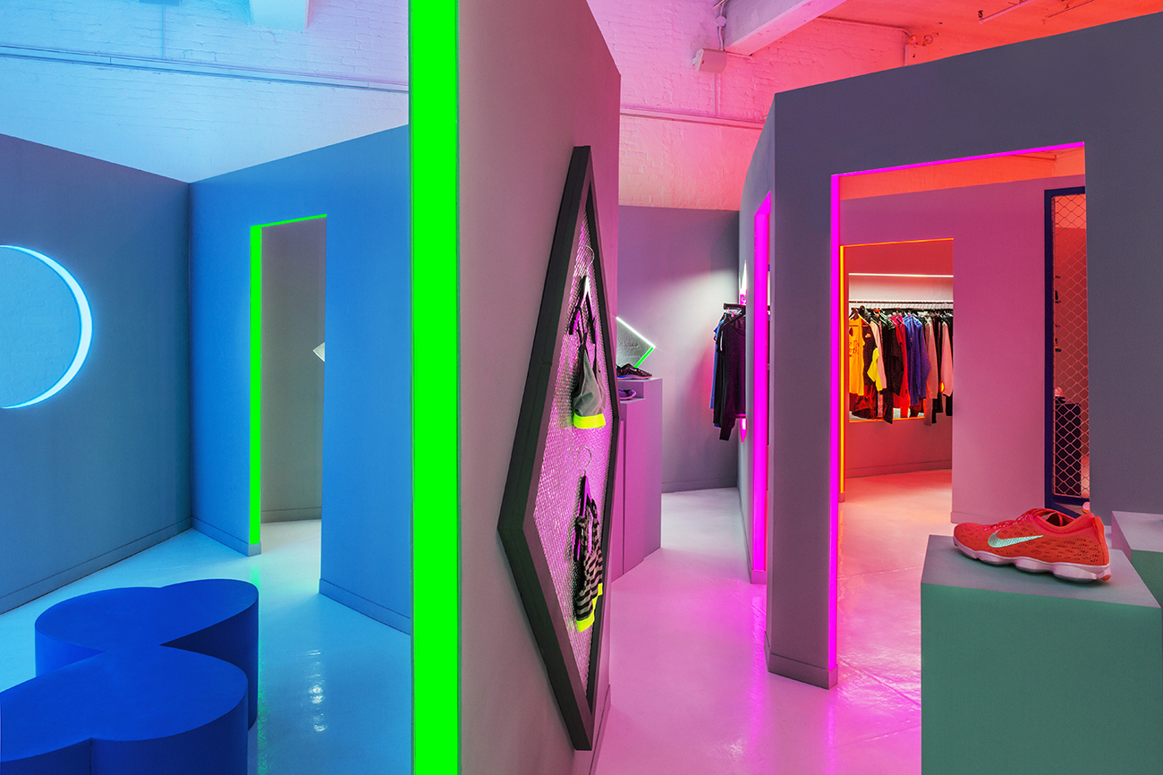
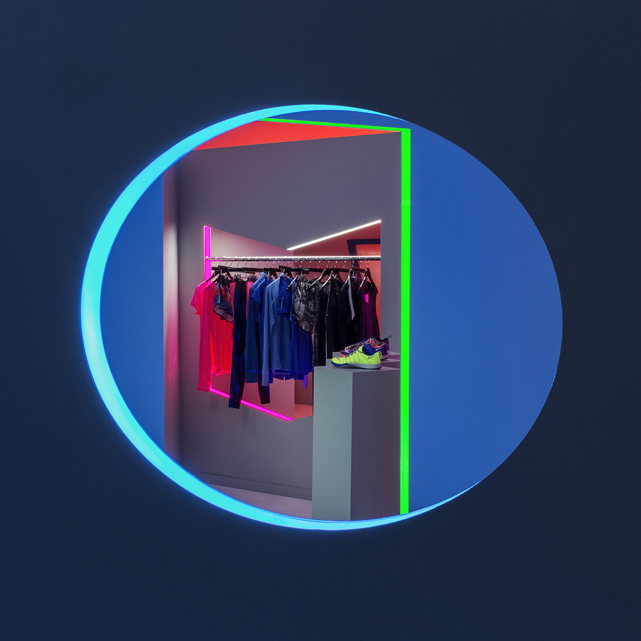
You know those fun-mirror mazes in museums and odd attractions, peering through portholes, laughing at altered figures, navigating perplexing passageways? Imagine a vermilion glow cut across by ultraviolet pink, ultramarine edged with neon lime, and paintshop white fringed with . . . well, fluorescent white. This is all accomplished with light: diffused hazy glows, bright LED strips, and walls half-tinted via reflection. Drawing from Dan Flavin's minimalist installations, Brill and Storey sought to "create a series of stories," spaces that would "literally bleed through from one color or story to the next." Glancing through a sickle-moon opening, a rack of clothes peers back. This is no maze, but rather the pop-up of Nike Women's fall/holiday collection. Windows are cut out in butterfly wings, chevrons, or spheres, holding between their edges bars of clothing - or are they beyond the openings, in the next room? Like James Turrell's Acton room, you can't quite tell if you're looking at - perceiving the objects - or actually sensing - touching the objects. The optical illusion only makes this collaboration between Robert Storey and Jen Brill more intriguing, and more exciting to explore.
Born from similar "aesthetics and dream projects" according to Storey, the opportunity came when Brill was contacted by Nike about the project and asked Storey if he was interested in collaborating with her. This wasn't the first break-through for set designer Robert Storey, noted for his bold geometries, bright colors and underlying whimsy. A young success, he started out assisting artists before he realized the freedom and creative potential of designing sets. Now freelancing for such clients as Kenzo, Mr. Porter, and Wallpaper, Storey grasps the importance of "creating environments" that develop a brand and build identity. Creative Director Jen Brill is known for synthesizing the best of diverse mediums. Starting as an art agent cultivating young artist's careers, Brill now cultivates ingenuity across boundaries in film, fashion, and design. Her work ranges from neatly-organized curiosities for a Ghurka ad to short films for Adam Selman and Cole Haan.
Nike is known for its vibrant, eye-catching sportswear in a world where sportswear often merely "gets the job done." What's remarkable about the fall/holiday collection is how it mirrors, indeed becomes a reflection of the design of the space - or perhaps it's the other way around. The tall, symmetric walls - which Storey describes as a "clean white exhibition space" - imbue the clothing with an artistic reverence. Diffused color lighting glows as you exit the mezzanine to enter the presentation space: LED strips gird the edges of each doorway and window to seemingly break off and set aflame the motif-ed swoosh which first brought Nike popularity. Stretched chicken-wire becomes a space divider, allowing air passage and a view into the next room, not to mention a visual parallel to chain-link pick-up games or tennis matches. As Storey describes, "I wanted it to feel soft and feminine with a nod towards a strong city environment," reflecting his sense of the collection. And the space clearly reflects that distinct personality of empowerment with an edge; of achieving something beyond the self. One wall is even dedicated to the mantra of the Nike Training Club: "We live to move and move to feel alive . . . sometimes out of breath never out of style." This wall opens out into the final space: a training room. It's a tribute to the club, and to the potential for each customer to get on their feet, to move, to progress. Tall white walls gleam against the sparse decoration of black medicine balls and steel weights. Here, there is nothing to distract between the person and the aspiration - so let's get to work.
Project Credits:
Client: Nike @Nike // Designer: Robert Storey Studio @StoreyRobert // Creative Director: Jen Brill Studio @brillapalooza // Construction: Aaron Somers Studio @aaron_Somers // Photography: David D Allee

Related Stories: