Quantcast

See design differently

  • SHOP
  • SUBSCRIBE
  • CONTACT
  • Architecture
  • Art
  • Style
  • Mini
  • Interiors
  • Design
  • The Edit
  • Travel
KNSTRCT
  • Home
  • Architecture
  • Art
  • Fashion
  • Kids
  • Interiors
  • DESIGN
  • The Edit
  • Travel
KNSTRCT
  • Home/
  • Architecture/
  • Art/
  • Fashion/
  • Kids/
  • Interiors/
  • DESIGN/
  • The Edit/
  • Travel/
KNSTRCT

Select, cutting-edge and highly researched design news

DESIGN

KNSTRCT
  • Home/
  • Architecture/
  • Art/
  • Fashion/
  • Kids/
  • Interiors/
  • DESIGN/
  • The Edit/
  • Travel/

Design

DESIGN RSS
January 04, 2015

Misery Vodka: An Honest Approach To Packaging

January 04, 2015/ Lenny Smith

Malmö-based Nordic Society for Invention and Discovery, takes a refreshingly honest approach to creating a bottle for a vodka - that isn't really that high quality.

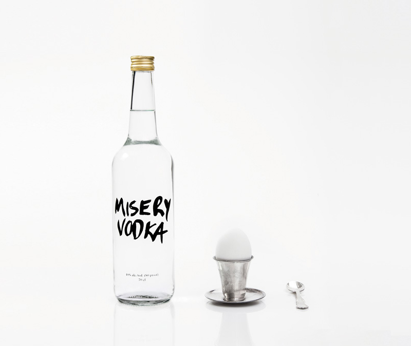
Misery is a micro-distillery in Iceland (actually, more of a moonshine operation). The vodka they make comes in very small batches. Every bottle is sealed by hand. The quality might not be the best, but it’s better than any of the other “ultra premium” industrial vodkas out there.”

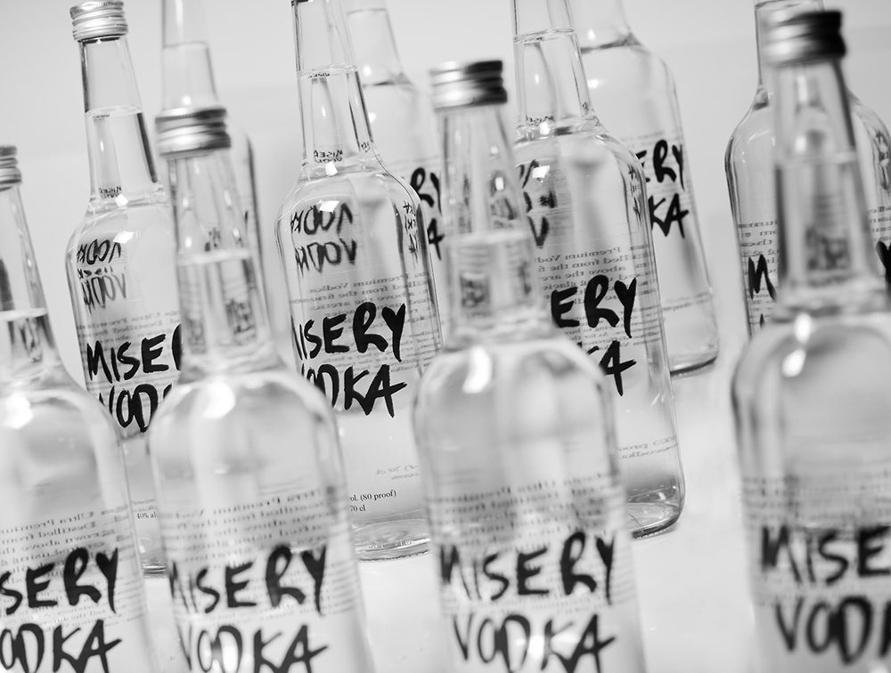
Designer Maria De La Croix says "the Misery Vodka packaging, for example, makes the most of the fact that it really isn't that high quality. The design simply features the words Misery Vodka on the front, scrawled in big black letters. While many would think this isn't the best way to sell your brand, many consumers will appreciate the honesty and slight humor thrown into this branding concept.”

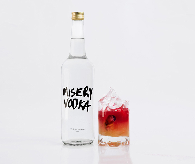
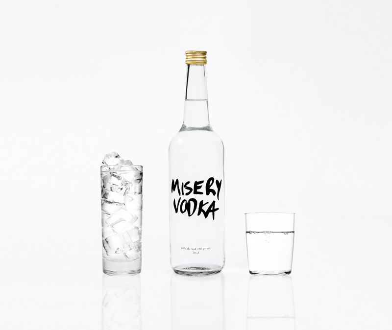
Croix's let's-level-with-ya approach to communicating the product to the consumer via it's packaging design is simple yet effective. Cheers to misery.


knstrct-facebook-icon.jpg
knstrct-twitter-icon.jpg
knstrct-insta-icon.jpg
knstrct-pinterest-icon.jpg
knstrct-stumble-icon.jpg


KNSTRCT-Sidebar-template-100x2.png
KNSTRCT-Sidebar-template-100x3.png
KNSTRCT-Sidebar-template-100x5.png


 Misery Vodka takes an honest approach to their packaging design
 Misery Vodka takes an honest approach to their packaging design
 Misery Vodka takes an honest approach to their packaging design
 Misery Vodka takes an honest approach to their packaging design
January 04, 2015/ Lenny Smith/
nordic society for invention and discovery, malmo design, sweden, norway, packaging design, bottle design, identity, branding, logo, graphics, design, art

Lenny Smith

  • Pure Function: Basik by Saana ...
  • Twin Tables: Two-Legged CS1 Coffee ...
Search
 
 
KNSTRCT-LOGO-white.png
 

ABOUT   SUBMISSIONS   ADVERTISING  CONTRIBUTORS  CONTACT

© 2013 KNSTRCT
All Rights Reserved.
Site Design By: Young Athenians