Interview: Talking Huys on 404 Park Ave with Piet Boon
/“It is very Dutch to create something homely, and to make the space as if it is mine.” - Piet Boon
The Delft Blue scaffolding covers of Huys (meaning “house”) on Park Avenue have finally come down to reveal a lavish, 58 unit apartment building that stands as a celebration of Dutch design. Bought by Kronenberg Group 12 years ago, CEO Lesley Bamberger called upon Piet Boon in 2010 to take the lead on this transformation of these ordinary offices to extraordinary homes.
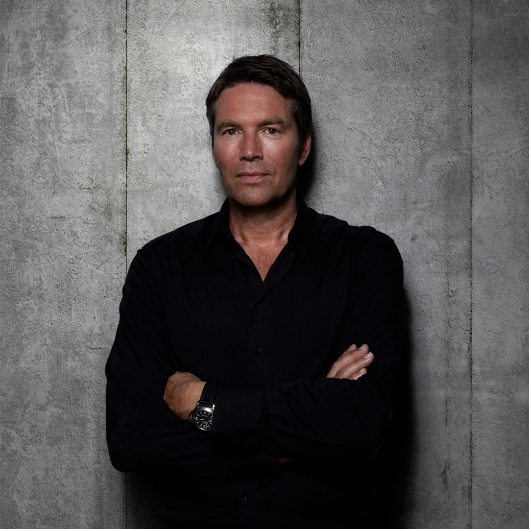
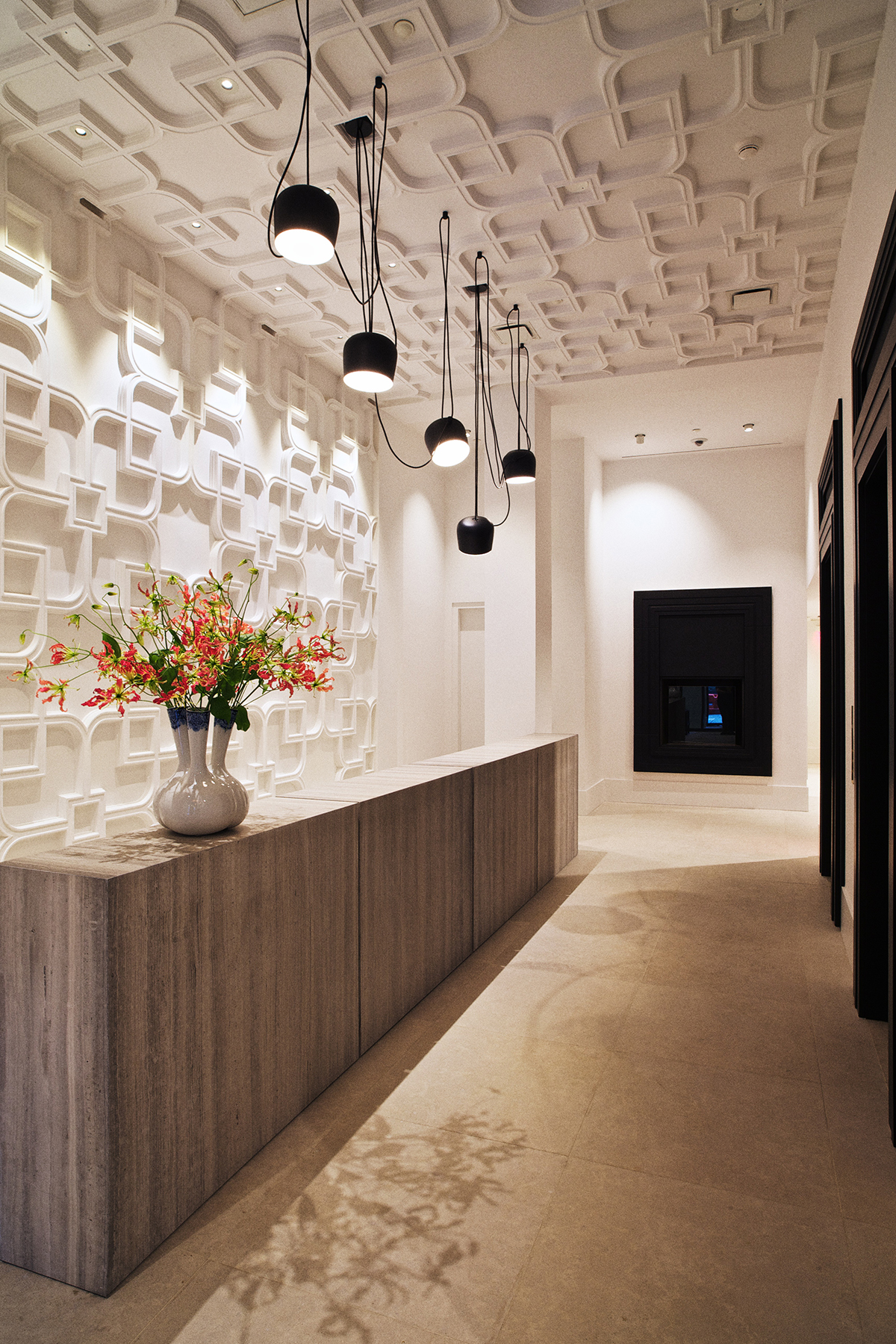
This week, KNSTRCT caught up with Piet Boon at an exclusive penthouse sneak preview. Crossing Park Avenue on 28th, Huys looms, glittering overhead. The façade retains elements of the original Manhattan architecture, but the expanded window frames announce a significant difference. As sunlight playfully bounces off the glass, the building shines with elegance and newness. Stepping into the cool, fresh and bright lobby, there is a sense of having left the chaos of the city streets behind, and entered the instantly recognizable comfort of European hospitality.
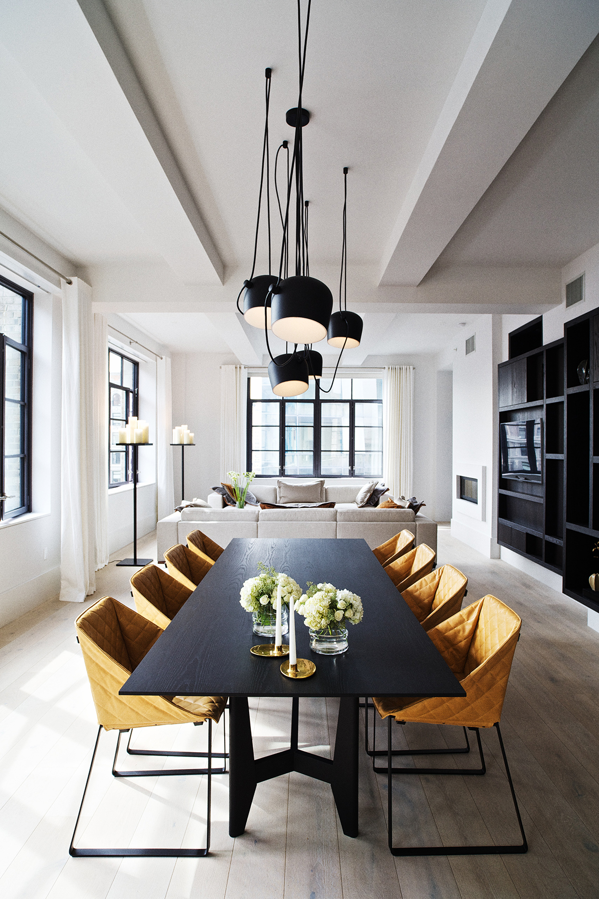
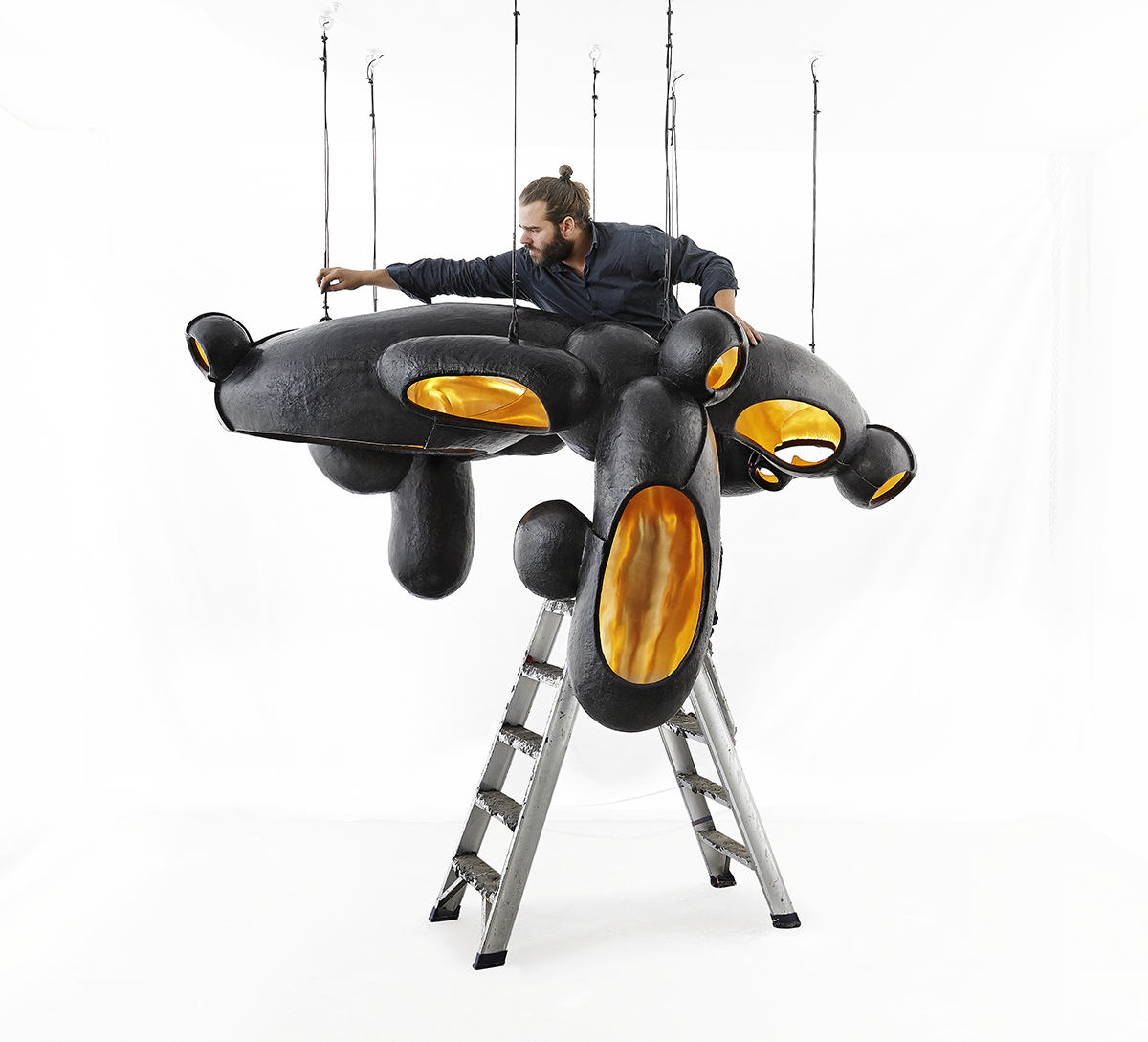
As 404 was originally an office building, the reception area is structurally quite small, but the space has been maximized to create a welcoming openness. Ceiling-to-floor glass doors, Georgian high ceilings, white stone floors and still a hint of the smell of fresh white paint that coats the walls. My attention was immediately drawn to the chandelier overhead, by Frederik Molenschot, and the stunning hand-painted vase by Hella Jongerius. There is a sense of calm that instantly puts you at ease, like returning to a place where you have been many times before.
Perched on a delicate moustache-shaped bench by the entrance, specially designed for two, Boon’s enthusiasm is as effervescent as his celebratory glass of champagne.
KNSTRCT: “Let’s start from the beginning – how did you become involved in this project?”
Piet: “It was four years ago that they called me to design a transition for this building. I have known Lesley for a long time. He has done more offices and shops in Amsterdam, but had seen my work in NYC, so he gave me a call and we did a pitch together.”
KNSTRCT: “What challenges did you face beginning the renovation?”
Piet: “This is a former office building, so it was a little difficult. The window frames were all high up to fit desks, so we had to get permission to expand the window frames – to pop them out and pop them back in – finally we got it. We were very lucky could build floor to ceiling window frames which gave all the apartments a lot of light. Then the next three years were spent designing.”
KNSTRCT: “Which features are Dutch, and which are specifically Piet Boon?”
Piet: “Piet Boon is very much about attention to detail, and you can really see that in the apartments themselves. As the building gets older, the features will age well, and become more beautiful. We see many buildings that lose their beauty after a few years. So we used a lot of durable materials that will last and keep their beauty – like the windows, custom-made doors.”
KNSTRCT: “Are all of the materials Dutch?”
Piet: “We imported a lot of materials from across Europe, from the wooden floors to the stone for the lobby, and all of the countertops.
I especially like this stone here (points to lobby floor) because it’s very clean and bright. It is from Belgium, and is called Pietra de Medici. We also used all Dutch designers to keep maintain the consistency and authenticity of the design.”
KNSTRCT: “The Dutch artist, Frederik Molenschot designed this chandelier – how did he become involved with Huys?”
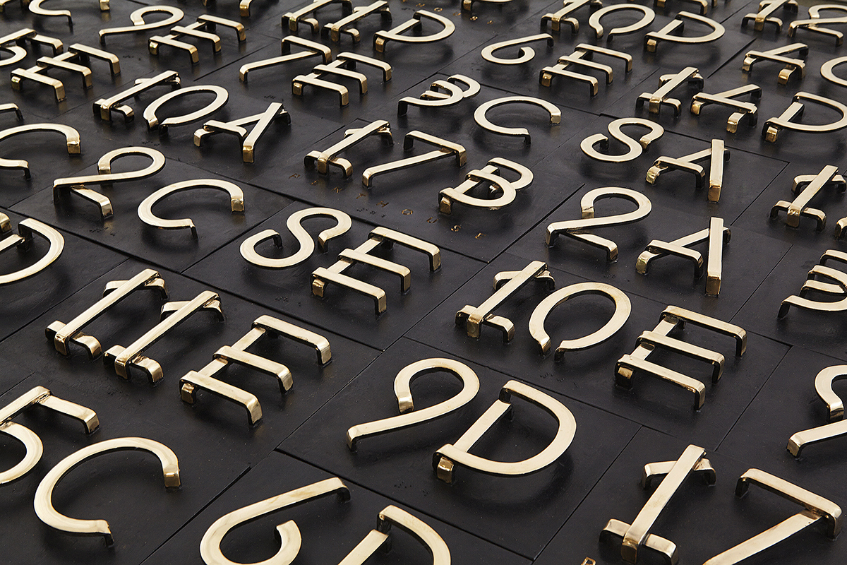
Piet: “I found him working in his workshop, and asked him to make me something. At the time, I didn’t like anyone, but I liked him – he’s a real artist. He made a beautiful fixture for my office, so I asked him to design a lighting fixture for Huys Then he became very interested in the idea so we asked him to design the numbers on the canopy and the entrance - so the story of Frederik is throughout the whole building. For him it was nice because he was a little unknown at the time, but since this project, he has been reviewed by the New York Times.”
KNSTRCT: “The overall design of the building is quite traditionally Dutch – lots of white, blue and clean lines. Where do you think Molenschot’s “organized roughness” fits with this look?
Piet: “I love bronze, it is a real living thing, and so the contrast against the white walls works well. The building will be famous because of that chandelier – people can see it as soon as they walk by. Also, look up – you cannot see where the light comes from. The bulbs are hidden, so it looks completely natural. We try to do as much as possible with LED. It’s bright, beautiful and saves energy.”
KNSTRCT: “I watched the video where you give a tour of your own home, which includes a lot of energy efficient features – is that an important element of design for you, and have you incorporated that into the homes here?”
Piet: “Yes, that is very important to me. I like to include as much energy efficiency and functionality as possible throughout the space. Unlike Holland, there are a lot of codes in NYC, but we made it work."
Eager to see the penthouses, I almost miss the elevators which blend seamlessly into the walls. As the doors open onto the 15th floor, a long corridor stretches ahead leading to penthouses A & B on either side, and with a narrow panel of soft carpet underfoot, there is already a feeling of coming home – I wish.
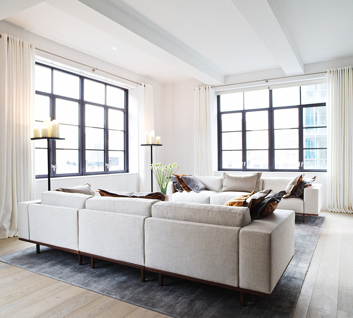
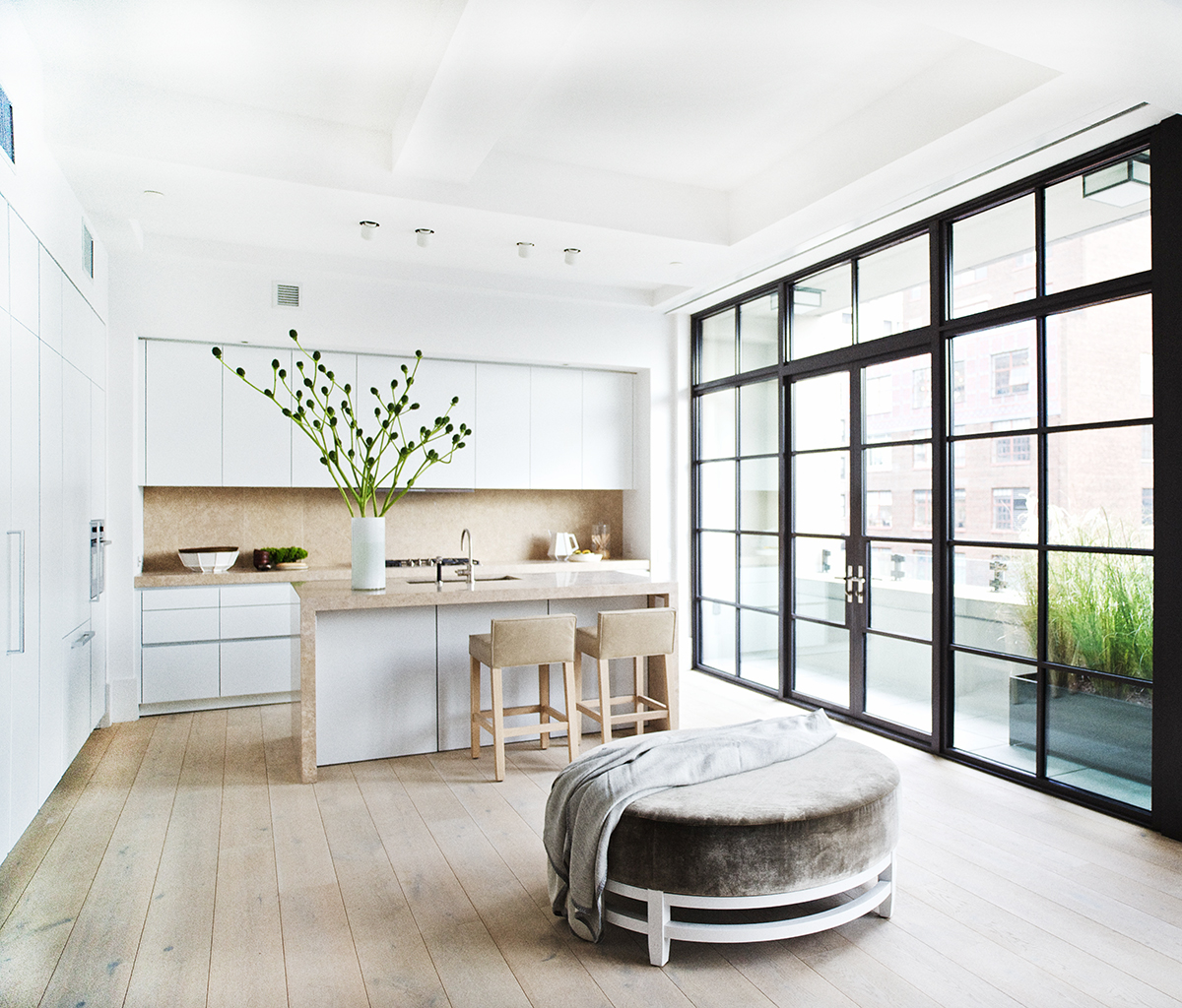
The distinctive Piet Boon design continues effortlessly from the lobby into each room, white walls offering a vast expanse of maze-like space as each room neatly connects with the other, defying conventional apartment structure. Much like his own home, you can wander from the kitchen to the living room to the bedroom quarter and loop back to where you started from.
The windows are truly remarkable, offering stunning views of the city and allowing an abundance of light to flood throughout the space. High ceilings offer grandeur, the specially imported European materials provide smooth, touchable finishes and the wide hallways combined with ceiling-to-floor doors create an effortless fluidity throughout.
Piet: “I think the whole layout is Piet Boon. It is very Dutch to create something homely, and to make the space as if it is mine.”
KNSRTCT: “What are your favorite features about the building?”
Piet: “We have high base boards throughout the whole building - a kind of signature look. They’re functional and last longer, but they also look great."
This is a prominent aspect of the designer’s ethos – every element of the design is not only aesthetically pleasing, but is suited to family living in its efficiency and durability. Storage units appear out of nowhere, secretly embedded in the walls; no handles on kitchen cupboards (also ceiling-to-floor) and bedroom wardrobes blend into the overall design. You can tell that these apartments are built as homes. Fireplaces glow next to sinkable sofas, dark wooden furnishings warm the bright white walls and each room presents that distinctly Dutch element of luxurious functionality.
Piet: “Doesn’t it feel like someone already lives here? We wanted to create that feeling, where it’s not so cold like some modern buildings, and it feels like a real home. It’s important to create that in a city like this - It’s luxurious, yet comfortable.”
Piet has already done several projects in New York, and feels that this modern Dutch design translates well to the city. As the remnants of Colonial Dutch design from the late 1600s remains hidden on the outskirts of New York, a Dutch Renaissance is taking place in the city.
KNSTRCT: “As you travel over and back a lot from Amsterdam to New York, have you grown to love the city?”
Piet: “I love doing things in New York. We’re doing a town house in the West Village, that’s where I want to live. It’s a lot like Amsterdam.”
Photography by: Paul Barbera