Sweet as Honey: Mousegraphics Packages Premium Honey
/Snapshot: Greek creative team Mousegraphics implements a packaging design for Foodscross’s new line of thyme-based honey, and its a packaging that realizes the very synthesis of elements that typifies the honey.
Mousegraphics excels in targeted communication, and for Foodscross’s new line of premium honey, the Greek creative design team makes some careful packaging design choices that convey the specific allure of Foodscross’s new product: for this honey contains an 80% percent concentration of thyme pollen grains, the Mediterranean plant which has been in use from Ancient Egyptian culture to the present.
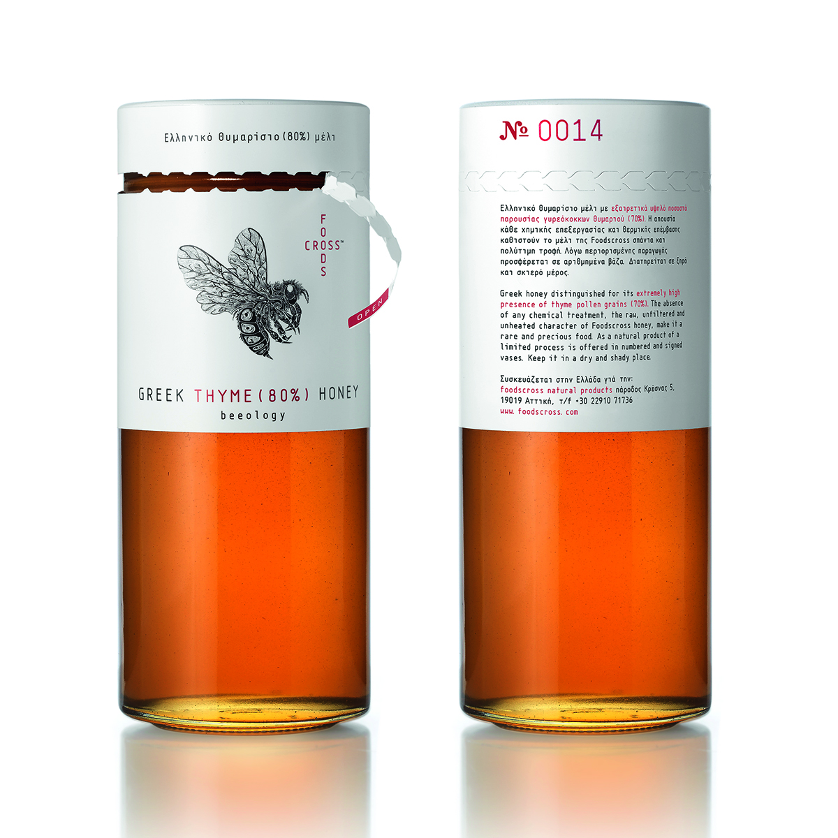
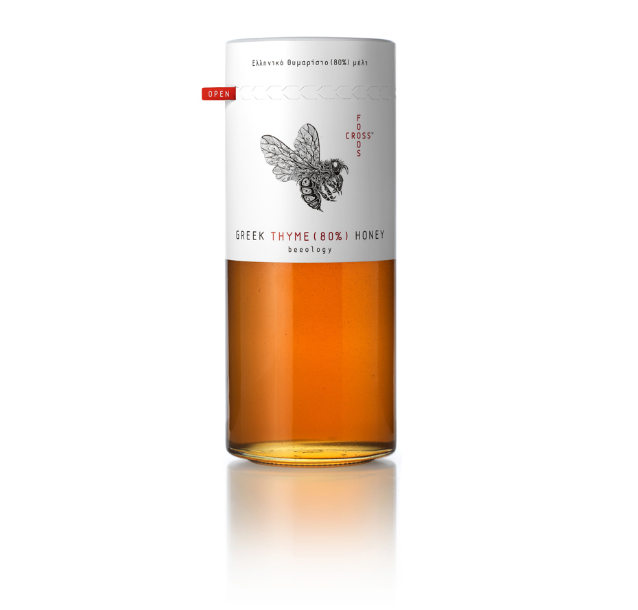
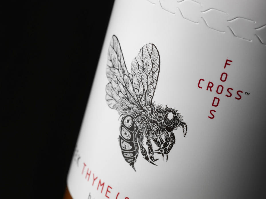
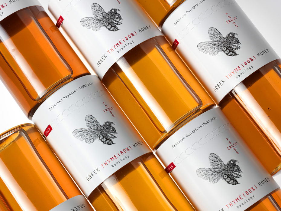
Synthesis is at the heart of the honey, and mousegraphics’ job is to make it the heart of the honey’s packaging. The logograms and signage have been implemented to this end: the company name “Foodscross” is appropriately cross-written à la acrostics, with the “Trademark” (™) signage placed after “cross” to ensure no mix-up on the occurs as to the company’s name.
To the lower left is an exotic print of a bee. The artwork, performed by internationally renowned Si Scott, does justice to the cultural underpinning that the animal has for Greece; it has been the subject of classical poetry as much as it has been a staple animal in Greek husbandry. Miniaturized and incredibly detailed, Scott’s graphic is an allure in its own right. This is an artist that wouldn’t be out of place in a tattoo parlour, and its a credit to Mousegraphics for its recruitment of such a talented person.
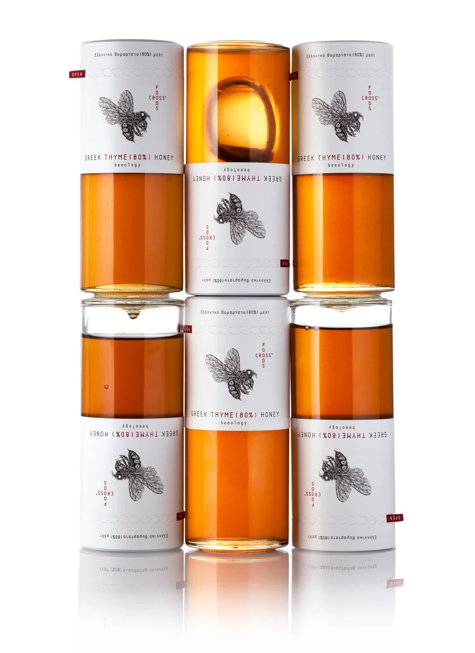
Synthesis implies the union of parts, of course, and the wonderful bee graphic would be lost without the packaging context into which it figures--which is a white backdrop that may be unremarkable in itself, and yet, is starkly contrasted with the clear glass cylinder the top half of which it conceals. This beautifully embodies Mousegraphics’ intent to materialize the idea of synthesis, since the colours contrast with each other quite harmoniously, the white never stealing the allure of the golden honey colour. The packaging is executed with an indie flare in that is disregards the norm, but when it comes down to it, the execution is so simple that the allure is increased tenfold.
The white label also conveys a purity to the honey that juxtaposes nicely with the fact that this honey is so heavily condensed with thyme, a fact that is itself printed in red upon the label. The total effect of the glass container is directly comparable to pharmaceutical packaging and is sure to draw parallels to the health benefits that natural honey holds, especially with the thyme. Even though honey has been used for pharmaceutical purposes for centuries, appropriating a similar packaging design is very distinct and innovative on Mousegraphics’ part.
These nutritional facts alone are enough to capture the attention of the targeted audience of sophisticated individuals both in and outside the Greek market, but simplistically printing such materials in a way that doesn’t detract from the real seller--the honey itself--is a great touch that defies the extravagance sometimes bogging down mass-produced items, and is a nice alternative for a modern buyership indoctrinated with the notion that the “not-in” is the new “in.”
Photography courtesy of Mousegraphics